I'm a 40-something guy, currently living and working in Nantes, in the north-western part of France. I've been in the IT since the early 2000's, so I'm slowly slipping into the "elders" group (let's say "experienced", instead )
You should be able to find more about me if you know how to Google .
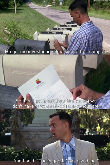
I currently work in a "fruit company" —in the Forrest Gump way— :
 ... but not the one on the left. The other one :
 So... "Hello, colleagues !!!"
You're becoming an expert at something when it is faster to script a solution than google it.But also :
You're an expert at something when you have made all possible errors on that very specificI still google a lot, but there are some errors I don't make anymore. So let's say the road is long but I'm on the path !something.
You will also find here some puns, "dad jokes" and geek references because
Here are some "competitors" I'm aware of that may be of some interest :
mine! Mine! MINE!!!), then I had enough experience / time / knowledge to share it. Let's say this is how I contribute to the open source : documenting things.
developmentversion), pages are XML documents which are transformed on-the-fly into HTML by my browser + XSLT stylesheets. When I created this, the 2 main conditions were it had to work :
productionversion, a Python script performs the XSL transformations and generates static .html files. Today,
pushing to prodis a matter of minutes .
I do my best so that it's optimized for people, with details, links and working examples. My "development" environment is Debian stable + Firefox, and as long as everything displays correctly, I consider it ok. I admit I don't check with other browsers or systems (...could be better, but, you know, I'm doing this on my free time). However, what you'll see here is plain HTML and CSS (mostly text, few images, no sound, no video), and the only "exotic" stuff you may miss on "unsupported" browser(s) is eye-candy such as color gradients, round corners, transparent icons or animated GIFs here and there.
what I do to know more about you) are :
This is something I've heard a few times, mostly from people :
More seriously, my color chart and CSS possibly "could be better" . But I like it this way : this is "me". I prefer doing this MY way rather than copying others (what for ? Remember : no ads ) and doing something I don't like. Many websites look like each other, already. Flat design is just a trend, and something more fashionable will replace it someday.
I actually wanted this to be as "semantically visual" as possible : commands are written like this, file names like that, this is code, and this mimics a shell output. I'm slowly learning CSS3 and CSS grids...
Like everybody else, I've spent time on forums and IRC (link for youngsters ), been the victim of some trolls and wasted sooo much time and energy in endless / pointless (both?) debates.
good ol'timesbut also that
Life is about choices..
Designed for Professionals)
But I admit Red Hat works great too and has good documentation. I'm just cautious about the C.C.B. : We prefer Red Hat because it comes with tech support.
. I'm ok with that, but in practice (working in IT for almost 20 years), I have NEVER filed a support case to Red Hat (meaning this _may_ not be money well spent. Unless you consider buying peace of mind, so it's ok ).
TAB or SPACE ?TAB (with TAB length set to 4 SPACEs) since this is what TABs were created for. I'm afraid this is the kind of question that has no answer since, whatever the pros and cons :
TABers and SPACErs) will be able to collaborate whatever the coding styles (not only indents), Mankind will have accomplished a great step forward.